
"I love the light. This is unmistakably your elegant style and I'm interested to know how you achieve that with acrylics, which are very different to use than soft pastels."
I briefly answered this in the comments in my last post, but did promise to enlarge upon it, which I will try to do now while it is fresh in my mind.
Actually, there are two main things in that question which need addressing. One is HOW TO ACHIEVE A SENSE OF LIGHT and the other is about STYLE. The third issue is techniques in different media.
STYLE:
I will deal with this one first. "Style" is a somewhat abstract concept, and has nothing to do with achieving a sense of light in an image. Style is the artist's own "handwriting". for example, Vincent Van Gogh had a very distinctive style - it was to do with the way he applied the paint, in linear strokes all over the surface. Here are two totally different types of image - a portrait and a landscape - yet he used similar mark making in both:


We recognise who painted these images because of the style he chose to use....and because this style became his "signature" and his preferred method of working. The surface is kinda disturbing, very active, perhaps a deliberate choice on his part, perhaps instinctive and somehow reflective of his state of mind. Sometimes, artists use different styles...depending on the mood of the image they want to achieve..or perhaps the subject matter.....they may alter their choice of mark-making - but somehow, when they have been working for a long time, their mark-making becomes recognisable...as does their choice of subject matter, and their overall approach to painting. Their "style" become recognisable.
LIGHT:
Achieving a sense of light in a painting is about a combination of choice of subject matter and close observation of TONES. Failure to achieve this sense of light when this is what you wanted, is so often to do with flat light on the subject, and/or incorrect translation of the tone of the colour.
Here are two woodland paths. One sunlit, one in flat light. The bottom one has no sunshine in it, just some hint of light in the far distance. The path is therefore going to look flat and uninteresting in a painting. The top scene, tho less interesting to me in terms of the shapes it offers - boring straight road - has the better light, and if I could find an image which would be a combination of the lovely light in the top one, and the interesting forms and echoing shapes of the bottom one..THEN I would happily tackle a painting.


I have noticed that often, students choose the subject matter because of the "things" in the scene, the place, the person, the objects........and they don't even think about the quality of the light in the scene.
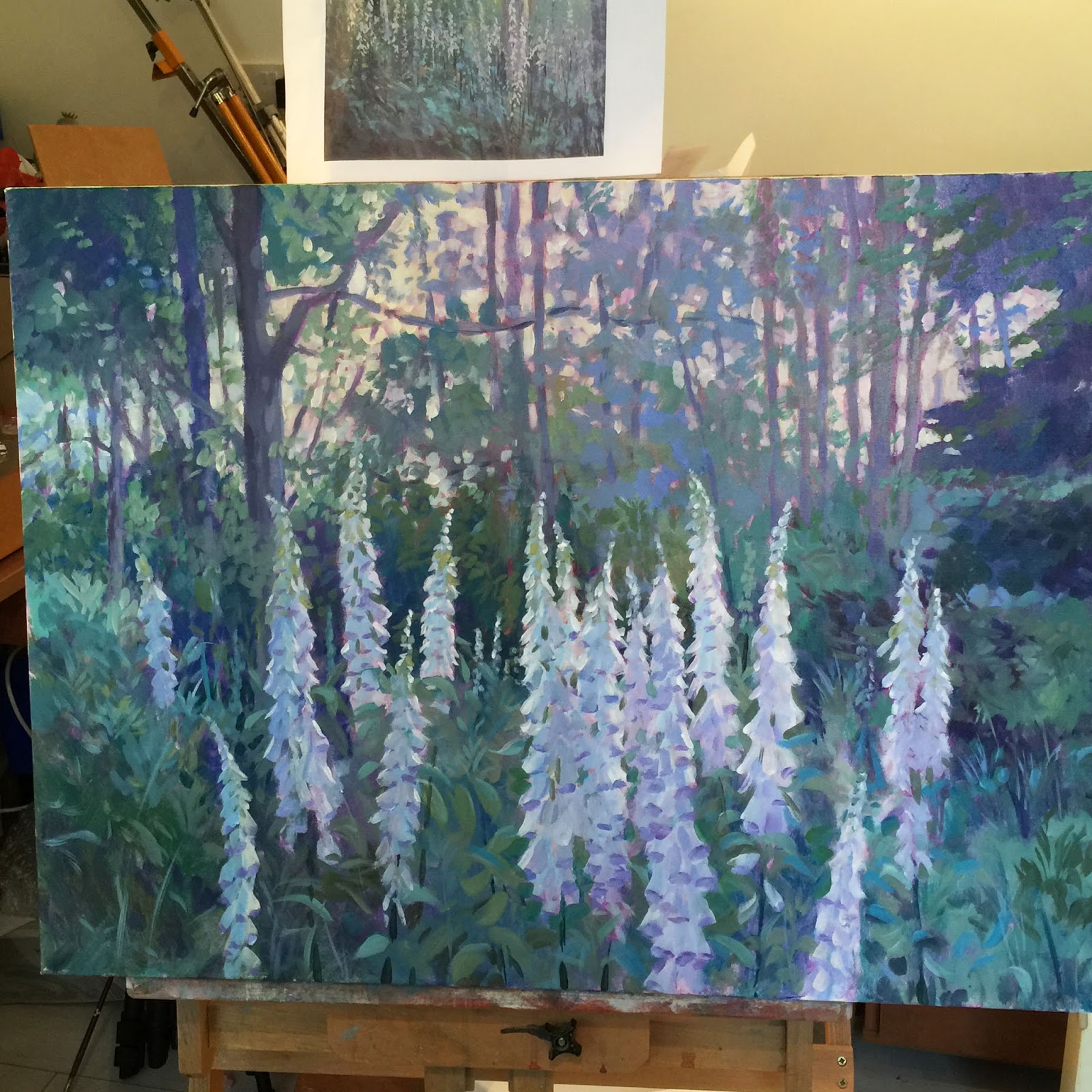
The quality of the light in the scene is what I look for FIRST. It isn't always about sunshine and shadows, tho I do love those; I also love soft light and have even painted rainy landscape scenes! My foxglove scene has a soft, gentle light...but I emphasised it with the light behind the flowers...they are backlit, with sharp light at the edges, and this helped enormously to add just enough drama to ensure that the scene was not flat and monotonous. You might think that the plants themselves would have done enough..but I promise you, this scene came to life when the tiny strokes of bright light were added.
The important thing for me always is that the LIGHT is as important as anything else about the scene....and often, it is the motivating factor for me. I never tackle any painting without looking at the light in the scene as a subject in its own right.
And then, to get that light right, you need to get the tones right. The right lightness, or darkness, of the colour. You have to continuously ask yourself "is this bit darker, or lighter than that bit? How much darker or lighter?". You need to do this all the time, guys. That takes patience and practice, and if you struggle with this, it can be worth working just in black, white and greys for a while until your eyes become used to translating colour into tone.
ACRYLICS AND OILS VERSUS PASTELS:
The final part of the question. Yes of course, paint and pastels are very different..but they are all made from the same pigments - pastels are just paint without the various binders that make pigment into liquid paint! And you use a brush with paint, no brushes with pastels. However, the same basic rules apply. With oils, acrylics and pastels, you can work from dark to light. You can "overpaint". You can scrape off areas you are unhappy with. You can start with thin areas, build up to thicker ones. Watercolour is the medium which makes you think, and work, differently because generally speaking, you have to "reserve" the lights, and work towards the darks! It is well-nigh impossible to "add in" lights at the end, or over darks, with watercolours.
So working with any opaque medium, whether you use a brush, or a stick of colour, all the basic painting principles are the same.
You have to find your way with using a brush of course.....stiff hog hair brushes give you one kind of mark; soft brushes will give a different kind of mark. It can take a little time to find out how to make the kinds of marks that please you, or that give you the effect you want. There are no hard and fast rules...mark-making with pastels also needs investigation and practice. When painting grass - you are PAINTING grass, not growing it! You have to practice to find a visual equivalent for grass - for water - for clouds - for skin. Marks which explain the subject to the viewer. Marks which feel "right" to you. All of this takes time and practice. Did I say practice often enough folks?
I do hope this answers the question that was posed.
Jackie
No comments:
Post a Comment
please feel free to leave me a message